
Size Perception Biases and Data Visualization
Should You Lie to Create an Honest Impression?

Humans are bad at judging the size of things. In a experiment, participants were asked to pour the same amount of liquid into two different cups; one tall and skinny, the other shorter and fatter. Participants consistently poured more into the short-and-fat cup, indicating that they over-estimated the volume of the tall-and-skinny. This may explain why many premium beverages use tall and skinny cups; Red Bull cans, champagne glasses, and premium liquor bottles. Though the aluminum or glass is used inefficiently in a skinny shape (with a worse volume to surface area ratio), this is intentional in order to create a stronger perceived volume.
This optical illusion is partially explained by the fact that we mostly see in 2D, while volumes are 3D. The fat glass has less height and greater width and depth. But we only see the height and width, and we fail to appreciate the greater depth. However, this effect still appears to a lesser degree when assessing 2D areas. Humans perceive circles to be smaller than squares, and squares to be smaller than oblong rectangles, even when they have the same area. Some researchers hypothesize that the human brain uses perimeter length as a heuristic when estimating area.
For these reasons, data visualization best practices advocate for bar charts over bubble charts or pie charts to represent quantities. It’s much easier to judge the height of bars rather than the area of bubbles or size of wedges. In the latter cases, small values are perceived to be larger. In a scatterplot in particular, a cluster of small bubbles may appear visually larger than a single large bubble. Don’t even get me started on 3D charts.
But sometimes you really do need to use areas. The most common case I’ve encountered is when a scatterplot needs a third dimension. For example, this chart below shows the relationship between countries’ wealth and happiness, showing an upward but tapering trend. However, there’s a bunch of small countries who are outliers, and that’s not a coincidence; perhaps they’re an urban-heavy city-state (like Hong Kong, Singapore, Luxembourg) or a tiny oil-rich country (UAE, Qatar). These small countries should be given less weight when looking for patterns, and a smaller size bubble indicates that.
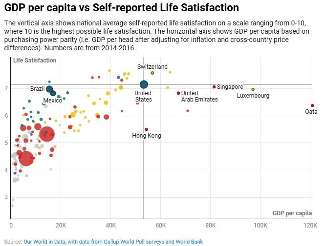
For this case, comparing sizes is not particularly important. How many times larger is the US than Mexico? Than Qatar? Visually, it’s not obvious that it’s 2.5x and 120x, respectively. But it doesn’t matter; you just need to know that the US and Mexico are solid trend indicators, and Qatar is not.
But perhaps size does matter; perhaps you’re using size to indicate the revenue you receive from a particular country, so it is important to judge Mexico’s relative importance to the US. How should you represent the data? You could scale the bubbles’ areas accurately to the values; Mexico’s bubble should be 2.5x less area, with 1.6x shorter diameter. This seems like a straightforward and honest method. But as we discussed, readers will still over-estimate the relative importance of Mexico.
To compensate, you could exaggerate the sizes to create the intended psychological effect; Mexico’s bubble could have 4x less area, to create the visual impression of 2.5x. User Interfaces do this all the time. Your car’s gas gauge will hit “E” for empty, but you’ll still have a good 10% of your tank left. Video games often do this with health bars; the last 1% of the player’s health bar may contain 5% of their health, and vice-versa for enemies. But I imagine if a data analyst was exposed as adjusting sizes this way, they would be accused of manipulating the data.
I ran into this problem at my day job. I’m making a scatterplot of Marvel Snap and our adjacent competitor games. The visualization is doubly confounded by the irregular game logos I’m using instead of bubbles. I’ve been going crazy trying to resize Fortnite and Clash of Clans’ logos to be psychologically proportional to their numbers. Fwiw, I’m definitely overthinking it. I should probably just go to bed.