
Measurement Theory for Surveys
What does “on a scale of 1 to 10…” actually mean?

On a scale of 1 to 10, how likely are you to recommend this blog to a friend or colleague?
Rate your agreement with the following statement:
“I am familiar with this type of survey question”
Strongly Disagree
Disagree
Neutral
Agree
Strongly Agree
These survey questions are ubiquitous. Untrained survey-writers often jump to these templates, perhaps assuming there’s some good reason for this cookie-cutter template, or perhaps out of thoughtless mimicry. There’s an air of scientific exactitude, as though attaching numbers makes the results more valid. Like many economists, I held a strong prejudice against survey analysis as garbage-in-garbage-out. But at Riot, I was forced to work heavily with survey data; games are psychological products that need psychological measurement, and we analysts were grouped under the same umbrella organization as survey researchers. I grew to understand their methods and the logical foundations beneath their inexact science. I’m still generally skeptical of survey data, but now I know how to work with it better. Don’t throw the baby out with the bathwater.
For the mathematically oriented survey skeptic, here’s an explainer.
Measurement Theory
Before jumping into surveys, let’s talk about measurement generally. Data usually falls into four categories of increasing “number”-ness: categorical, ordinal, interval, and ratio.
Categorical data are just what they sound like. Peoples’ locations can be categorized into states and countries. Food can be categorized into fruit, vegetables, grains, protein, and dairy. The central tendency here is simply the most-common category; there’s nothing else you can really do with it.
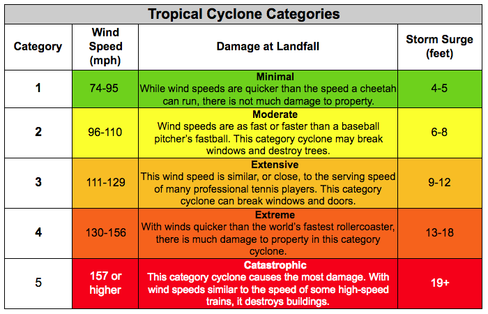
Ordinal data are categories that can be ordered. T-shirt sizes: S < M < L < XL. Ages: infant < toddler < child < adolescent < adult. Letter grades, Hurricane categories, etc. With order, we can take medians as a central tendency. While ordinal categories often come with numbered indexes, like hurricane categories, the value of those numbers isn’t meaningful.
Interval data has meaningful distances between values. This unlocks addition, subtraction, and averages. Yesterday was 2°F colder than today. The average temperature for the last week was 70°F. The time between 1pm and 3pm is the same as the time between 9am and 11am.
Ratio data introduces multiplication. There is a concept of 0 to serve as the basis for ratios. The 4m tree is twice as tall as the 2m tree. The distinction between ratio and interval data is subtle, as most interval data also has multiplication. Temperature offers the clearest counter-example. 20°F is not twice as cold as 10°F; 0°F is an arbitrary reference point. But 20K does have twice as much thermal energy than 10K, since absolute zero actually means zero energy.
NPS and Likert
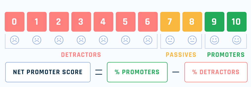
The two questions above are known in survey jargon as “Net Promoter Score” (1-10 scale) and “Likert5 Agreement”, and they’re both ordinal. They are often mistakenly treated as interval data, but it’s not clear that distances are meaningful. Is the agreement difference between “Disagree” and “Neutral” equal to the difference between “Agree” and “Strongly Agree”? Do two “Disagrees” and one “Strongly Agree” average out to “Neutral”? It’s not necessarily true, but possible under certain conditions.
Ordinal scales can have interval values imposed on them. For example, hurricane categories have windspeeds associated with them. If you assume an average windspeed within each category, you could average them together. However, these windspeeds are not linearly distributed. You can’t average the category numbers together; you have to map them to windspeeds first.
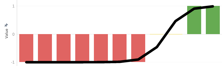
Theoretically, a similar mapping is possible with ordinal survey data. Net Promoter Score (NPS) is often aggregated in this way: take the % of promoters (9-10 responses), subtract the % of detractors (0-6 responses), and the result offers a numeric aggregation. Implicitly, they are assuming that promoters have a value of +1, detractors are -1, and passives are 0 (see chart). This seems plausible. NPS is meant to be a measure of social virality for organic user acquisition. Perhaps, in some original study, NPS’ creators found that promoters or detractors would persuade or dissuade one additional customer, respectively, fitting a sigmoid function.
The metric was created and popularized in 2003 and applied in industries like rental cars, financial services, and manufacturing. However, times have changed, and it’s not at all obvious that this same scale-to-outcome mapping applies. In the age of the internet, influential promoters or detractors could have outsized influence compared to near-neutral. 10-point scale use varies dramatically by industry and demographics. In my experience, younger people and Brazilians tend to rate everything more highly. With increasing inequality, distrust of mega-corporations, and fear of data-gathering, survey response behavior has likely changed too.
Net Promoter Score at least attempts to convert surveys’ ordinal scale to an interval value. Many naive Likert survey analyses simply average the 5-point agreement scale together. Is there a better mapping?
Perception and Psychophysics
Ideally, you can map survey responses to measurable outcomes to calibrate your scale. On League of Legends, we ran a Likert5 agreement question asking if respondents were interested in purchasing a skin. When comparing against actual purchase rates, it looked something like this:
Strongly Disagree – 0%
Disagree – 0%
Neutral – 0.1%
Agree – 1%
Strongly Agree – 10%
Most of the scale didn’t matter at all. It’s practically exponential. The main thing worth looking at was the “Top 1 box” respondents (Strongly Agree) and ignoring everything else. However, a simple Likert average would place undue value on shifting players from “Strongly Disagree” to “Disagree”.
Why is there such a sharp behavior? Purchasing a skin is kind of a big hurdle. Players are spending $10 for something that has zero gameplay impact, when they could buy a whole-ass indie game for only a little more. Moreover, purchasing outcomes are binary; either you buy or you don’t. It seems to me that outcomes could be fit to a sigmoid function, and the Likert5 scale resides strongly on the left-side of the S-curve’s inflection point. That side of the sigmoid is very similar to an exponential curve.
Exponentials are very common in psychophysics: the study of psychological responses to physical stimuli. Psychophysics uses a concept of “just-noticable difference”. When two stimuli are too similar, human recipients can’t tell the difference. For most domains, just-noticable differences are proportional to the base level: ∆X / X. A whisper is audible in a quiet room, but not in a loud one. This applies to many sensory domains: brightness, acidity, spiciness, electric shocks, etc. The math nerds out there might recognize ∆X / X as the defining characteristic of exponential growth. Accordingly, many sensory perception scales are exponential; audio decibels and earthquake decibels come to mind. When your local Thai restaurant asks you for your ordinal scale of spiciness (low, medium, high), they are usually adding exponentially more chili peppers in the kitchen.
Exponential outcomes are common in player behavior as well. “Whales” are infamous in free-to-play games for providing the bulk of revenue. “Engagement Whales” also exist, whose time spent playing follows dramatically long-tailed distributions. Player skill also tends to follow extremes at the top end; the skill gap between your 1st and 10th best player is likely similar to the skill gap between your 1,000th and 10,000th best player.
All this to say: outcomes are usually lopsided. Extreme responses tend to dictate outcomes far more than averages or medians.
I haven’t touched on the multitude of survey response biases that plague analysis. There are so many factors to consider, and surveys are often so idiosyncratic that it is very difficult to pin any of this down. But at the very least, I hope this has clarified common measurement and aggregation mistakes found in surveys, and provided a stronger mathematical foundation to tie nebulous survey responses back to actual outcomes.
These ordinal scales are often a crutch in order to aggregate mass responses. Nobody has time to sift through hundreds of free-text responses or video interviews. But perhaps that is changing in our era of AI. I’ve personally only run free-text surveys in the last year. I find that free-text is much richer, and I can use LLMs to categorize or score them, avoiding scale-use biases or multiple-choice bloat from traditional surveys.